
Pick a skill, make it yours
Anthropic publishes a whole shelf of design skills and plugins. I took one, frontend-design, built the same climbing club site three times (no skill, the stock skill, and my own version of it) and screenshotted what changed.
My last post ended on a challenge: if nothing in your design is yours, write a skill. Before you write one from scratch, it’s worth knowing that Anthropic has already written a few, and you’re allowed to take them apart.
A quick disclaimer for the screenshots later on. Gritline, the climbing club in them, was made up by the model, along with its members, meets, prices and every person named on its pages. Any resemblance to a real club, business or person is pure coincidence. The crags are real places and some of the route names are real classics, but the grades, descriptions and conditions were generated too, so don’t plan a day out with them.
What Anthropic ships
The public anthropics/skills repo has a creative and design shelf. Each skill is a folder with a SKILL.md, which is plain markdown that tells Claude how to approach a kind of work.
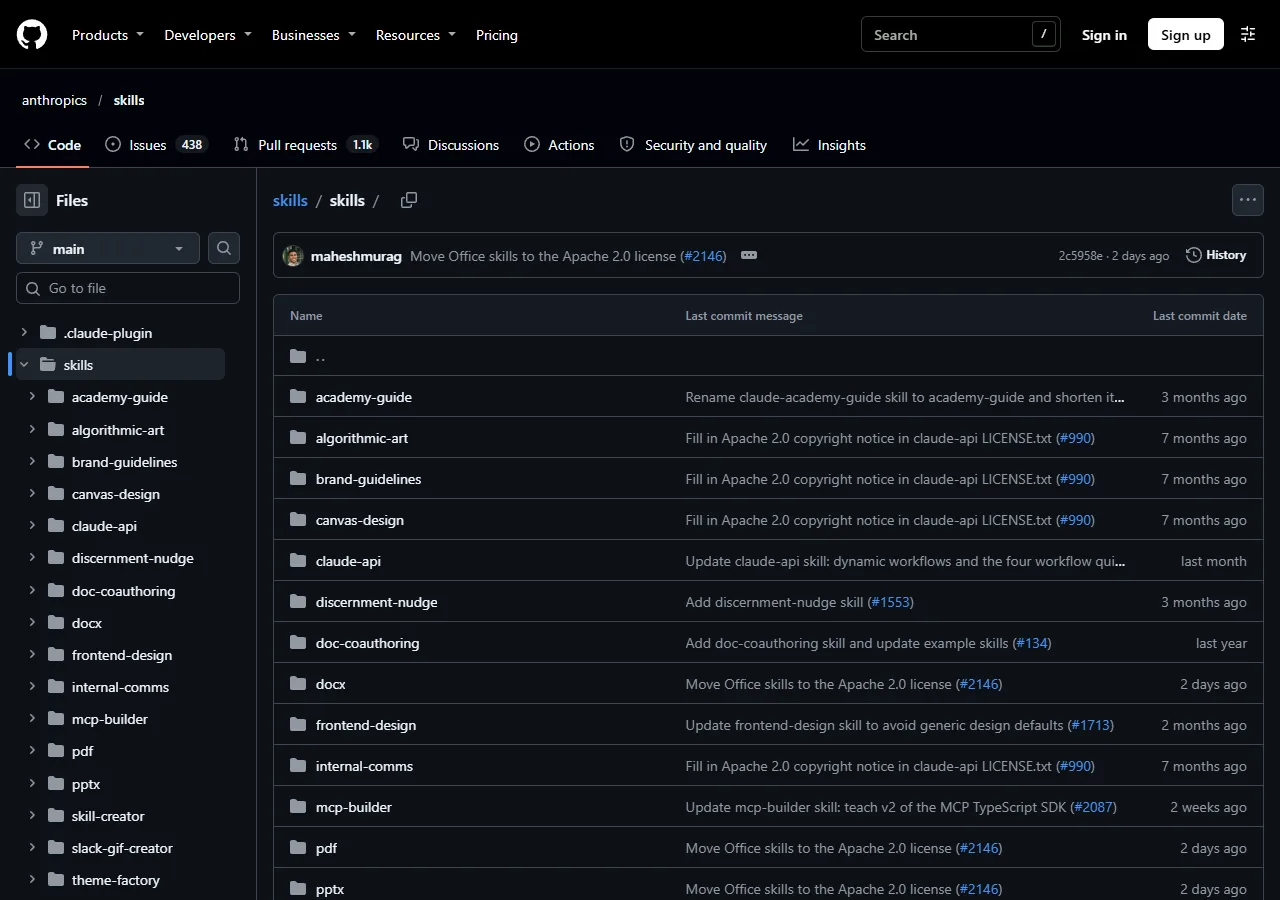 anthropics/skills
The design ones:
- frontend-design pushes Claude towards a distinctive, deliberate look when it builds a UI, and away from templated defaults.
- canvas-design makes posters and static art as PNG or PDF, starting from a written design philosophy.
- algorithmic-art makes generative art in p5.js with seeded randomness.
- theme-factory gives you ten preset colour and font themes for slides, docs and pages, or makes a new one.
- brand-guidelines applies Anthropic’s own colours and type, which makes it a good template for writing your own.
- web-artifacts-builder builds bigger claude.ai artifacts with React, Tailwind and shadcn/ui, bundled into one HTML file.
Then there’s the design plugin in Anthropic’s knowledge work plugins, which I have installed. Its skills are design-critique, design-system-management, ux-writing, accessibility-review, user-research and design-handoff, with commands like /critique, /accessibility and /handoff on top. Those are more about reviewing and handing over design than making it.
And then there’s Claude Design, which I wrote about last time.
Pick one
I picked frontend-design, because it’s the one that changes what actually gets drawn. It’s also Apache 2.0, so you can fork it and publish your changes.
The bit that sold me is its calibration list. It names the looks that AI-generated design keeps landing on, so the model can steer away from them:
For calibration, AI-generated design right now clusters around some traits:
1. a warm cream background (near #F4F1EA) with a high-contrast serif display
   and a terracotta or warm-clay accent ...
2. a near-black background with a single bright acid-green or vermilion accent;
3. a broadsheet-style layout with hairline rules, zero border-radius, and dense
   newspaper-like columns;
4. the SaaS-card kit ...
5. template chrome that appears whatever the subject ...
Reading that was humbling. In the last post I art-directed Claude Design myself to get away from the generic look, and asked for cream paper, hairline rules, no rounded corners and one hot accent. That’s trait 1 and trait 3 at once. My “distinctive” brief was a default too, just one I’d picked myself.
Same brief, three runs
So I set up a small experiment. One brief, written once and pasted into three fresh agents, all on Opus 5.5. None of them were allowed to load any other skill or look at the other builds.
Build a single-page website for Gritline, a members' climbing club in Sheffield
that maintains a free online guidebook to the gritstone edges of the Peak
District (Stanage, Burbage, Froggatt and Curbar). The audience is local
climbers, from people moving from indoor walls to their first outdoor routes,
to old hands checking whether the rock is dry this weekend. ...
Make it creative and memorable.
The brief describes the subject in detail but doesn’t art-direct it. Last time the brief carried the opinion. This time I wanted the skill to carry it.
- Run A got the brief and nothing else.
- Run B got the brief and Anthropic’s frontend-design skill, word for word.
- Run C got the brief and my modified version of the skill.
It’s one run each, so it’s a demonstration rather than a benchmark. Run it again and you’ll get different pages. But the differences below are the kind I’d expect to see again. The screenshots were all taken at 1280 pixels wide, and you can click any of them to open it full size.
Without the skill
 A: the hero
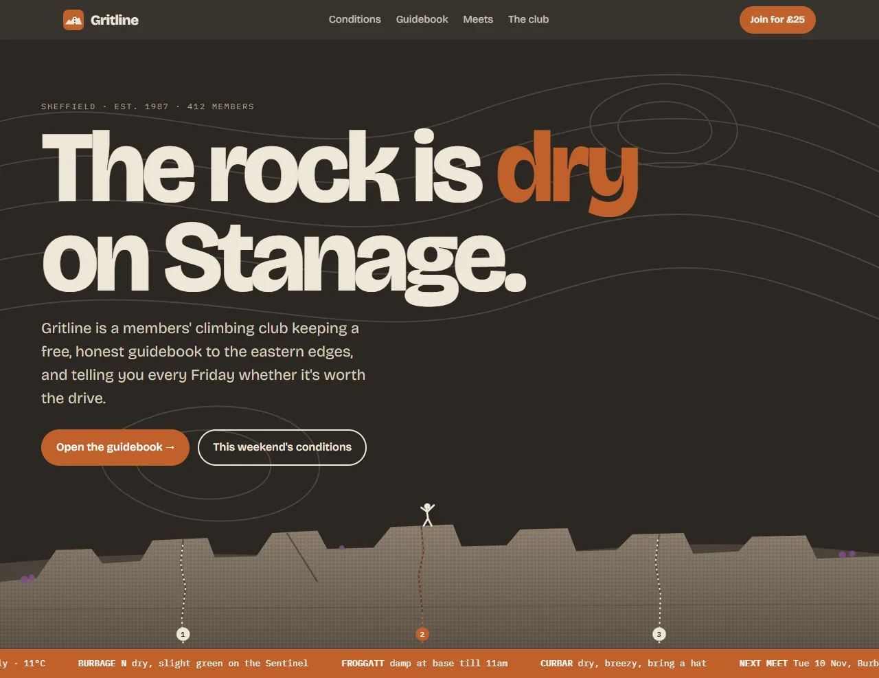
Honestly, this is better than I expected. It took the subject seriously: “The rock is dry on Stanage.” is a good headline, and there’s a drawn edge with numbered routes and a climber who’s topped out.
But it’s also a checklist of the habits the skill warns about. One word in the headline is picked out in orange, and the label above it is tracked-out capitals joined with middle dots. The button has an arrow on the end, the small data is set in monospace, and a contour map sits behind everything as wallpaper. At some window widths the text also runs right up against the left edge of the screen, which is a bug rather than a style.
 A: conditions
 A: guidebook
 A: the club
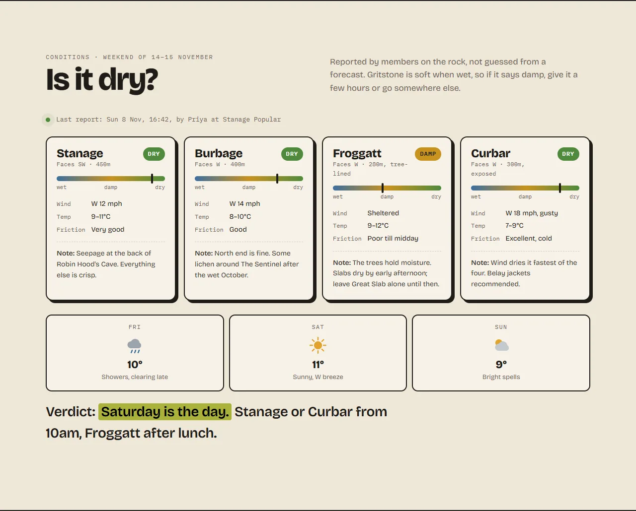
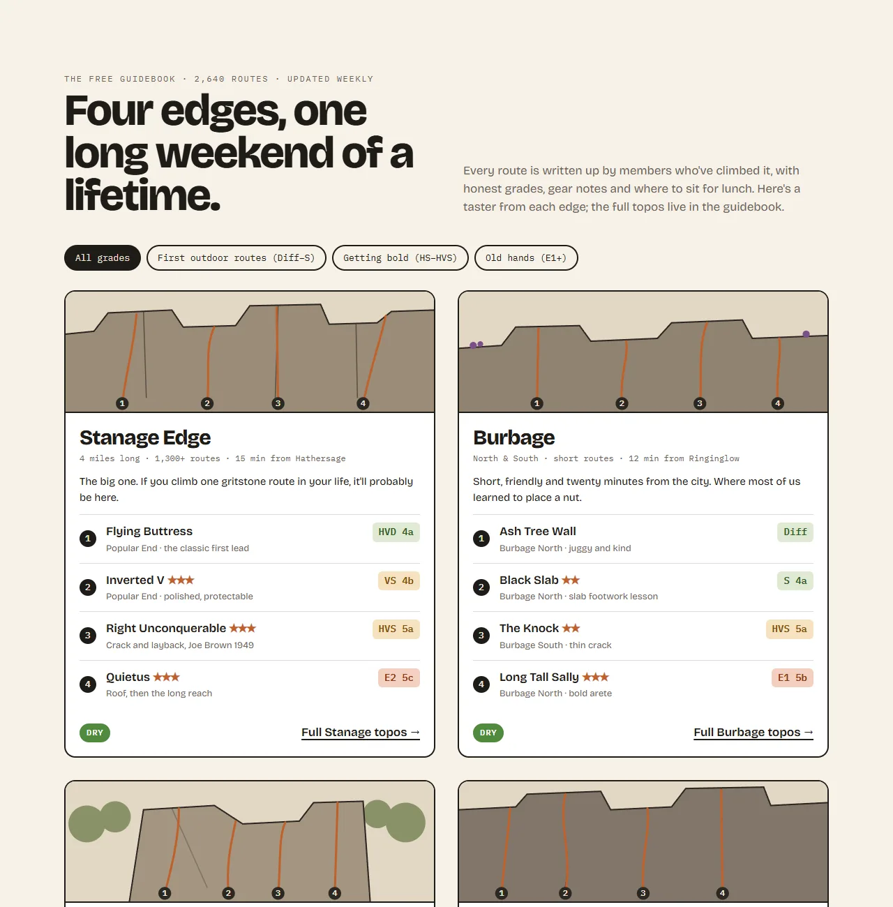
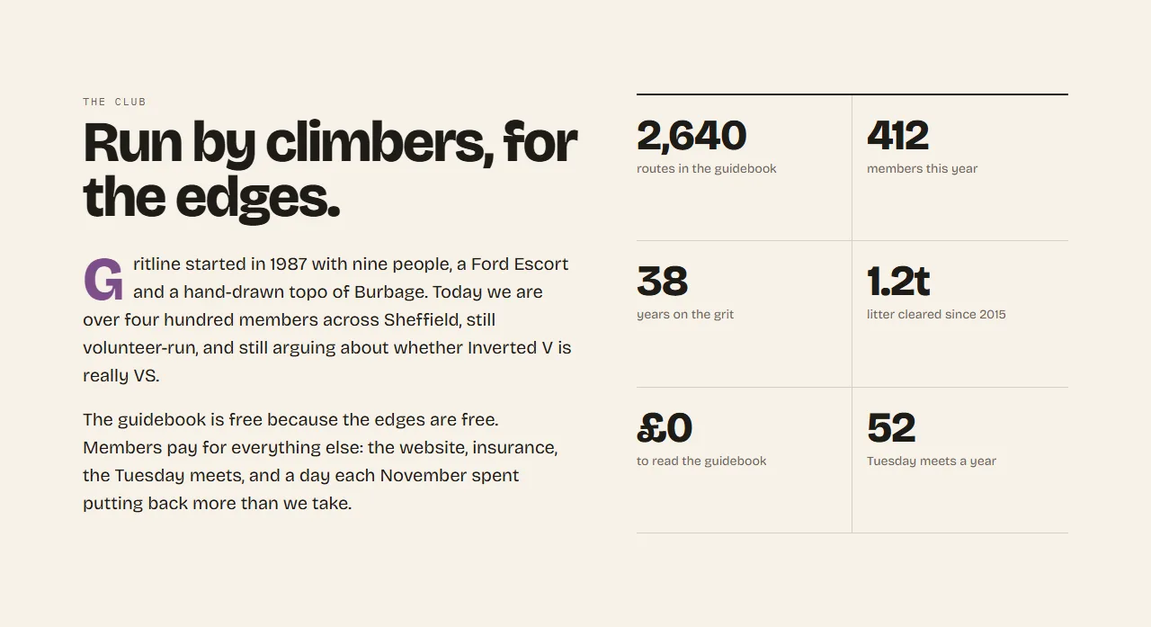
Further down it gets more familiar. Conditions come as rounded cards with weather icons and temperatures, grades sit in coloured pills, and the club section is a grid of big numbers with small labels, which is the exact treatment the skill calls the default.
None of that is wrong on its own. It’s just what turns up when nobody decided otherwise. You can also see run A as one long image.
With the stock skill
 B: the hero
The skill makes the agent plan first and then check that plan against the defaults before writing any code. Its report back shows the plan changing:
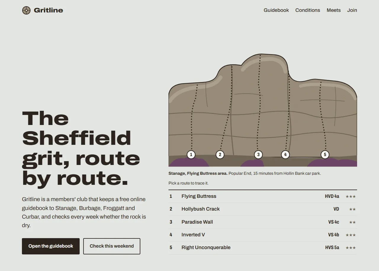
- Its first idea for the hero was a stats strip (“4 edges, 2,300 routes”) over a crag picture. The skill calls the big number with a small label the default hero, so it swapped it for a topo, the route diagram every climber already knows how to read.
- It planned four crag cards, recognised the card kit, and turned them into guidebook entries instead.
- It dropped a serif headline with a sans body because that was heading towards the cream and serif look.
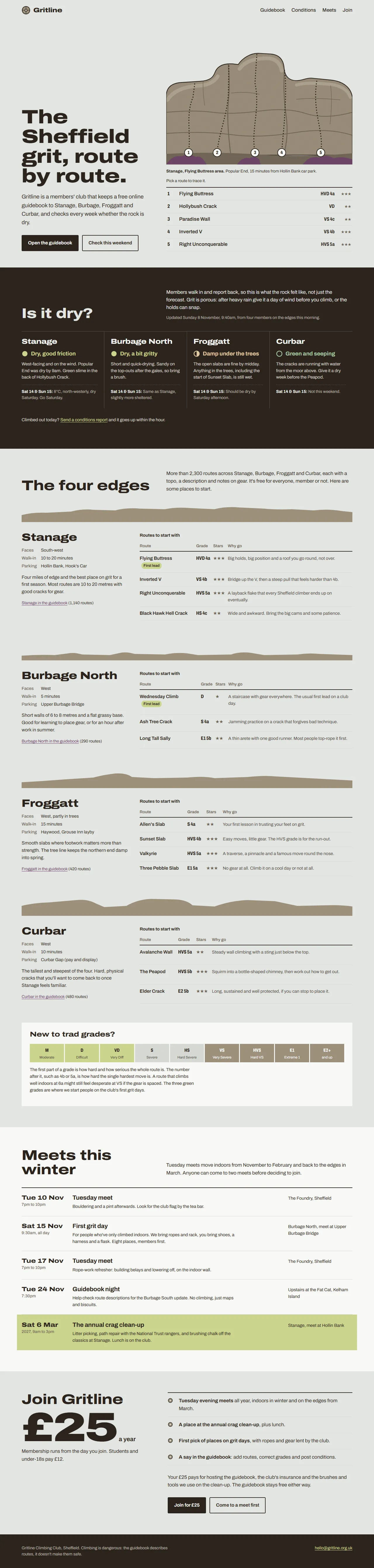
What came out is calmer and more specific. Five numbered routes drawn on the buttress, which is numbering the skill allows because routes along a crag really are a sequence. A key that traced each line when you clicked it, with grades set like a guidebook. No eyebrows, no middle dots, no arrows.
 B: conditions
 B: guidebook
 B: meets
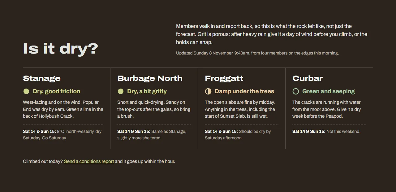
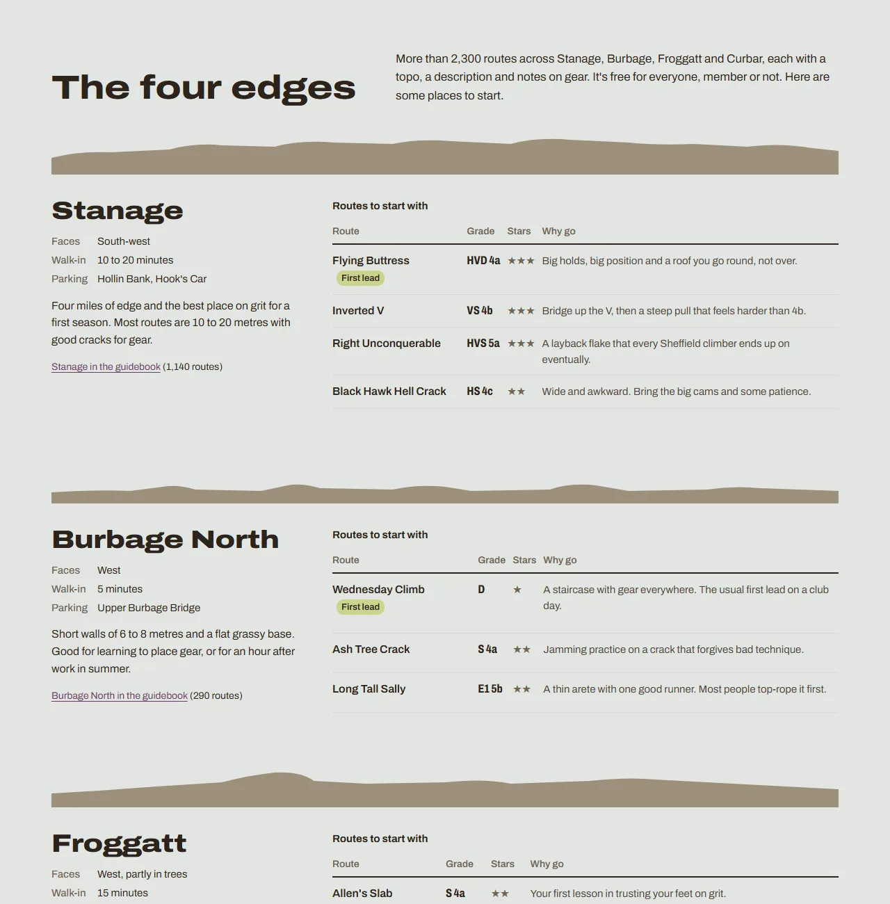
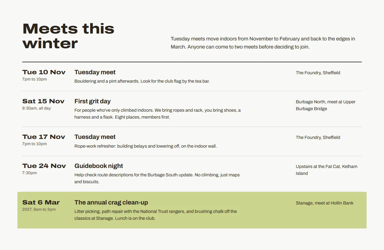
The calm carries on down the page. Conditions use a filled, half or empty circle as well as colour, so they still read in greyscale. Each crag in the guidebook is introduced by its own skyline, and the crag clean-up is the only thing on the page that gets highlighted. Run B as one long image.
Changes you can make yourself
The stock skill is generic on purpose. It tells the model to draw on “the subject’s industry, subject matter, materials, and vernacular”, then leaves the model to guess what those are. That’s the gap you can fill yourself, and you don’t need to be a designer to do it, because each change is a few lines of markdown. I made three, each one something you could copy for your own subject.
Give it the vernacular. I added a section that tells it what climbing actually looks and sounds like, and made the hero use it:
## Climbing vernacular (Added)

- **Topos.** Guidebook route diagrams: a crag's outline drawn in pen, with each
  route as a line climbing the face and a number at its foot. ...
- **UK grades.** Trad routes carry two grades ... Set grades like a guidebook
  does, never as badges or pills.
- **Conditions.** Climbers care about friction, not sunshine. ...
Add your own tells. The calibration list stops at five. I added the defaults I fall into, starting with the one from my last post:
6. Cream paper, hairline rules, zero border-radius and one hot accent. I chose
   this for a "distinctive" brief and it is trait 1 and trait 3 at once.
7. The outdoor brand kit: a mountain silhouette with a sunset gradient ...
8. Headline puns about heights and reaching: "Reach new heights", "Elevate" ...
9. Weather shown as a sun or cloud icon with a temperature, when the reader
   needs a decision ("Stanage is climbable today").
That list should keep growing. Every time you catch a default, whether it came from the model or from you, add it.
Make the plan auditable. The stock skill asks for a design plan but lets it disappear once the code is written. Mine makes the plan the first thing in the stylesheet, followed by a token block, and bans raw colour values after it.
The full modified skill is published next to its licence, with every change marked “Added”. Apache 2.0 lets you do this as long as you keep the licence and say what you changed, and once you have, it’s a skill you can hand to the rest of your team.
With my skill
 C: the verdict and the topo
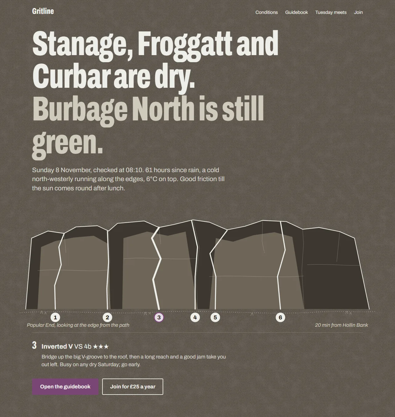
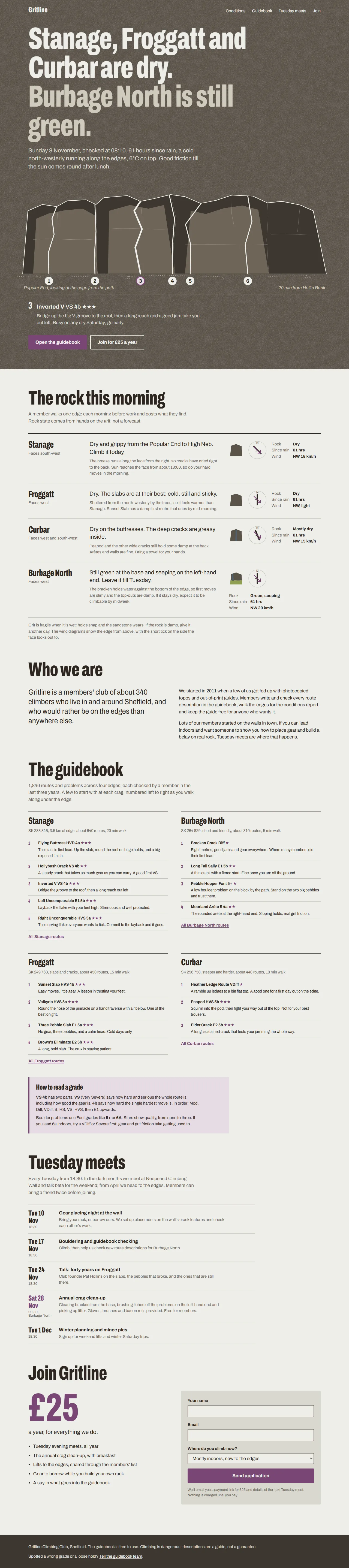
This one opens with a decision instead of a mood: “Stanage, Froggatt and Curbar are dry. Burbage North is still green.” Then it tells you why, in the terms a climber cares about: hours since rain, the wind along the edge and how long the friction lasts. That’s tell 9, the one about weather icons, doing its job.
Below it is a topo where tapping a route brought up a readout with its name, grade, stars and beta. The page uses one spot colour, heather, like an old two-colour guidebook. Lichen green and a seep blue only ever mean the state of the rock.
 C: conditions
 C: guidebook
 C: meets
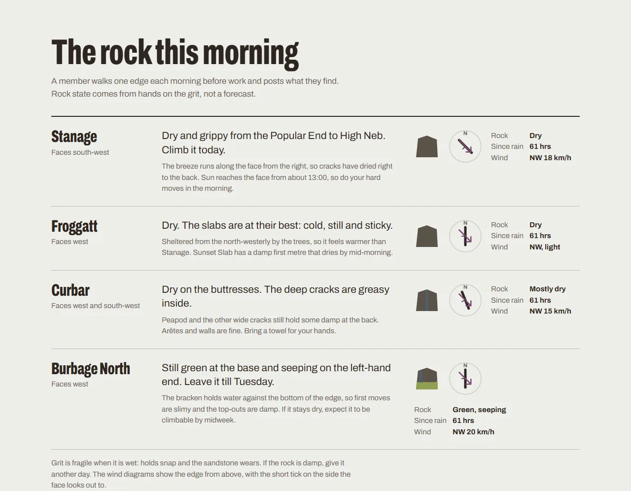
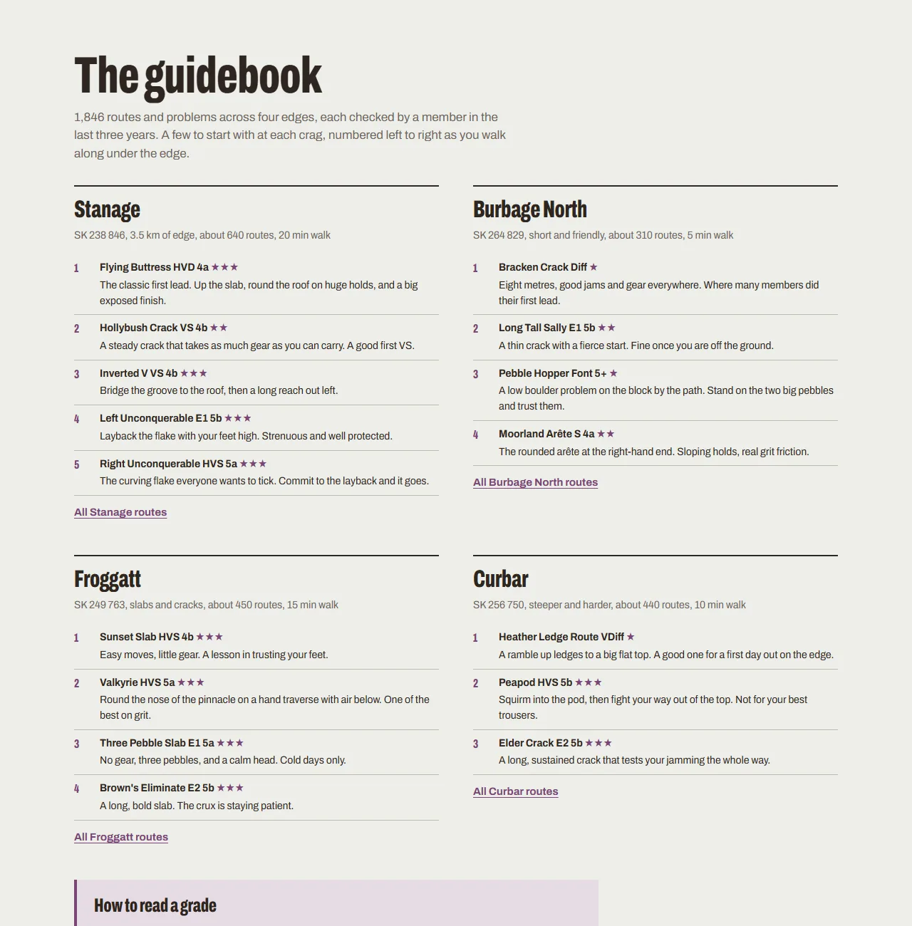
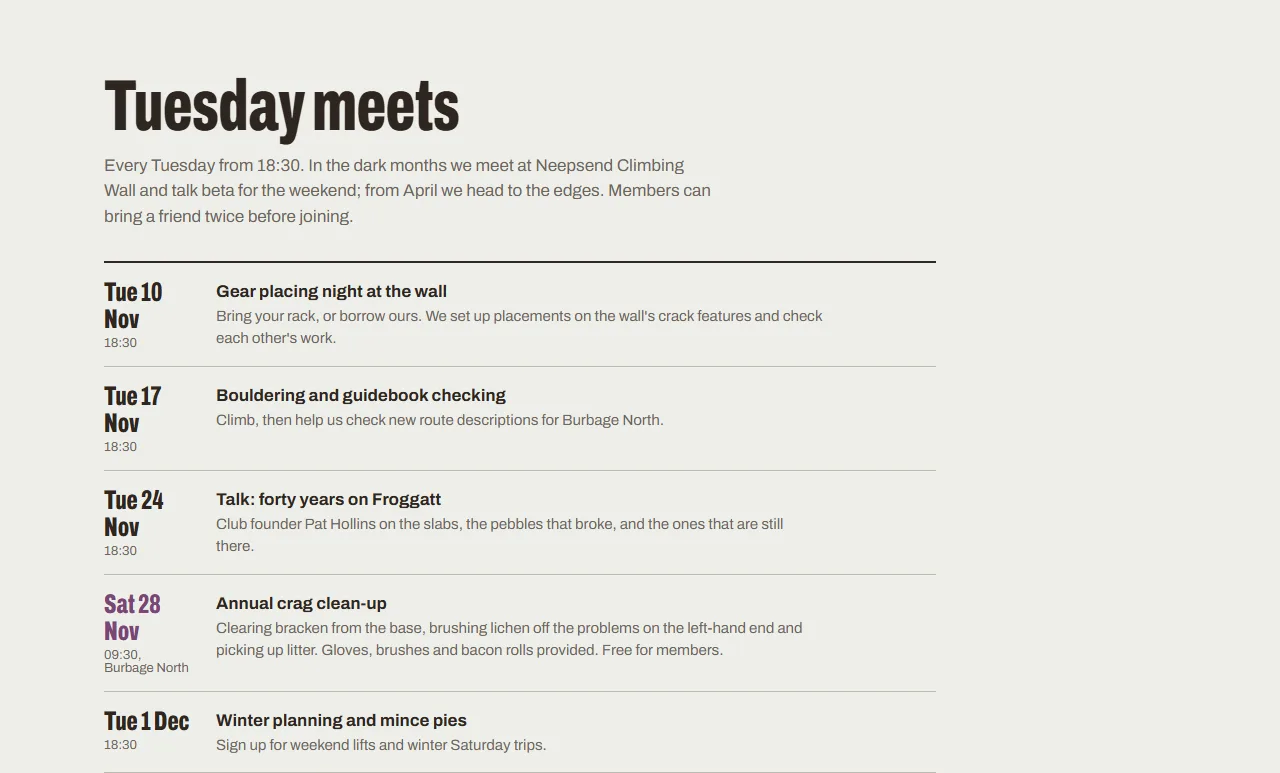
Conditions are verdicts rather than forecasts, with a little diagram of the wind against each edge. The guidebook reads like the small print of an old guide, which is exactly what the vernacular section asked for. Run C as one long image.
And the plan is right there at the top of the file:
/*
  GRITLINE DESIGN PLAN
  Primary job: answer "is the grit dry?", then send people into the
  guidebook and to join (£25).

  Palette (5 + 2 support tones)
    rock       #5A5248  the gritstone face; hero ground
    chalk      #EDEEE9  a cool, slightly grey chalk white
    peat       #2E2620  body text; a brown, not a tinted black
    heather    #7A4676  the single guidebook spot colour
    lichen     #8FA052  used only to mean "green / damp rock"
    seep       #4F6170  used only to mean "seeping / wet"
*/
:root {
  --rock: #5A5248;
  --chalk: #EDEEE9;
  ...
I checked: there isn’t a single raw hex value in the stylesheet after that block. The skill asked for it, so it happened.
Side by side
- No skill
- Stock skill
- My skill

Click any of these to see that whole page as one image.
The stock skill did most of the heavy lifting. It got rid of the template chrome and pushed the page towards the topo. My changes did something narrower but, for this club, more useful. They pointed the page at the question climbers actually ask on a Saturday morning, and they made every choice traceable.
Final thought
Anthropic’s skills are a starting point, and a good one. The stock frontend-design skill alone took a decent page and made it specific. But the version that knew what a topo is, what climbers check before they drive out, and which of my own habits to avoid built the page I’d actually want if I ran the club. So pick one skill, read it properly, and add what only you know.