
Everyone wants to look unique
Claude Design is a fantastic product, and without serious effort you'll still end up looking like everyone else. That isn't the AI looking like AI. It's the AI predicting from what you gave it, so creativity, skills and other mediums are what make the difference.
Everyone wants to look unique. Your landing page, your deck, your product: nobody briefs a designer with “make it look like the other twenty in our space”. You want people to see it and know it’s yours before they’ve read a word.
A fantastic product
Claude Design is a fantastic product. You describe what you want and it gives you something that looks finished: a layout, a prototype, a set of slides, with sensible spacing, decent type and colours that don’t fight each other. A few rounds of feedback and you’ve got something you’d happily put in front of people. I’ve used it for things I’d never have had the time or skill to do well myself, and it’s genuinely changed how fast I can get an idea into a shape someone else can react to.
And it doesn’t just guess. Give it a one-line brief and it comes back with a short form first: what the product does and who it’s for, the main goal of the page, which sections you want, the tone of the copy. Every question is optional (“Skip anything and I’ll decide”), so it’s the first place you could give it an opinion of your own.
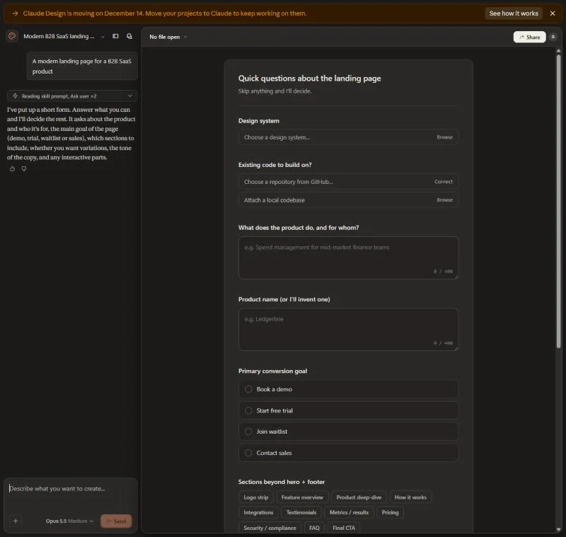 One line in, a form back
Still looking like everyone else
Unfortunately, without some serious effort, you’re still going to look like everyone else.
So I tried it. No design system, the one-line brief, and “Decide for me” on every question. It came back with Meterline: a dark navy page, a two-tone headline, a ghost button that says “Book a demo”, and a live usage card with a purple bar chart.
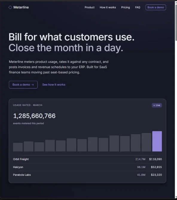 Decide for me
It’s good. I’d ship it. It’s also a page you’ve seen a hundred times, and you could swap the logo for any of fifty companies without anyone noticing.
It’s not looking like AI
People call that “looking like AI”, and I don’t think that’s quite right. The AI isn’t adding a house style of its own. It’s giving you the most likely answer to the question you asked, and it’s working from what you gave it.
If what you gave it was “a modern landing page for a B2B SaaS product”, you got the average of every modern B2B SaaS landing page. That’s a correct answer. It’s just the same correct answer your competitors got, because they asked the same question with the same lack of anything else to go on.
The output looks generic because the input was generic.
So when your design looks like everyone else’s, the useful question isn’t what the AI did wrong. It’s what you gave it that nobody else could have.
Creativity is still a serious need
That’s why creativity hasn’t gone anywhere. If anything it matters more, because the bar for “looks good” has dropped to nearly nothing. Anyone can get a polished page in an afternoon, so polish stops being the thing that sets you apart.
What sets you apart is the decision someone made on purpose. A colour that’s slightly wrong in a way you like. A layout that breaks the grid because the content needed it to. A tone of voice that sounds like a person rather than a product. Those come from someone having an opinion and pushing for it, and the AI can’t have that opinion for you. It can only carry it out once you’ve got one.
Feed it something nobody else has
Three things have made the most difference for me.
Skills. Write down what makes your look yours and package it as a skill: your type choices, your spacing, your colours and when not to use them, the patterns you’d never ship. Then every design starts from your taste instead of from the average. It’s the same idea as skills for engineering work. The know-how stops living in one person’s head and starts shaping every output.
Other graphics. Bring your own material. Photos you took, illustrations someone drew, sketches on paper, screenshots of things you love from completely unrelated places. A reference the model hasn’t seen a thousand times pulls the result somewhere it wouldn’t have gone on its own.
Other mediums. Don’t start in the design tool. Start with a mood board, a voice memo, a page of handwritten notes, a physical object you want the page to feel like. Then translate. The further your starting point is from “a web page”, the less your result looks like every other web page.
To see how much this matters, I ran the same job again with the same model and still no design system, but this time with an opinion. I called it Tallyhouse, spend management for finance teams, and art-directed it as a 1970s Swiss railway timetable printed on cream paper. One heavy grotesk, signal red and black, no gradients or rounded corners, the hero a departure board of invoices arriving, and copy written like a station announcer.
- Decide for me
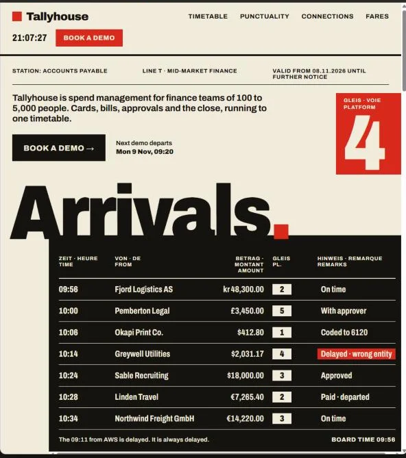 A railway timetable
Same tool, same afternoon. The board even has a running joke I didn’t ask for: the 09:11 from AWS is delayed, and it’s always delayed. Nothing about the model changed. What changed is that I gave it a point of view.
Build creative harnesses
AI is, to a large extent, a prediction engine. Give it nothing and it predicts the middle, which is exactly what it was built to do.
So the job is to build a creative harness around it: the skills, references, constraints and habits that move the prediction somewhere only you would have taken it. It’s the same lesson as harnesses for engineering. What the model reads decides what it does, and if you don’t decide what’s in there, you get the default.
That takes effort. You have to know what you like, write it down and keep feeding it new material. But that effort is the difference now, because everyone else has the same tool.
Final thought
Claude Design will make you look good, and that used to be the hard part. Now it’s the easy part. Start small: pick one design you’ve made with it this month and ask what’s in it that only you could have put there. If the answer is nothing, that’s your first skill to write.